RightNow Media had iOS and Android apps that were built using native languages, which meant two separate code bases to maintain. Since the user experience and interface needed to be redesigned, the decision was made to also utilize Flutter to reduce development complexity.
The Problems
RightNow Media had gathered a list of items needing to be addressed from a combination of support tickets, app store reviews, and inbound support team feedback. Due to the limited number of native developers, features and bug fixes were ping-ponged between iOS and Android, meaning one was always out-of-sync. With increasingly complex projects on the horizon, the business needed to make a change.
Flutter enters the chat.
Let's Start Smart
The first place I started was taking inventory of the existing app screens, taking note of their affordances, functions, and inconsistencies. Next I compared these results to the user feedback. From here, the product team (VP of Software, Product Owner, and myself) worked closely with other internal stakeholders (CEO, VP of Marketing, VP of Sales) to ensure the next design would meet goals of each facet of the business.
As the developers built out the designs, there were times the designs needed to pivot due to Flutter restrictions. Additionally, as the app was built, we had an internal team of testers providing us with feedback, which led to design iterations. The goal was feature parity with existing apps, yet we also added a few new features, such as dark mode for general and kids sections as well as integrating the Bible into the app, both long-time requested features.
Launched
After almost 2 years in development, the apps were launched to their respective app stores! A significant number of previously user-reported issues were remedied and we saw increased engagement, longer times within the app, and more content watched.
Splash
Simplified styled splash screen depending upon the user's system color theme.
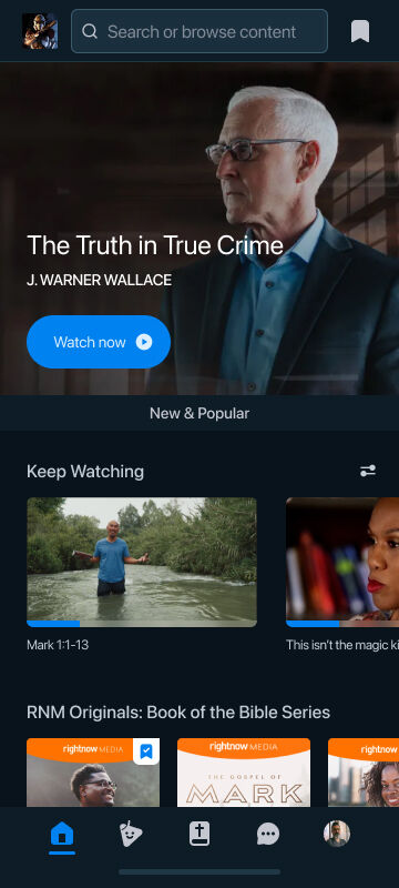
Library
Optimized library page includes quick access to your organization, search, and saved content in the header.
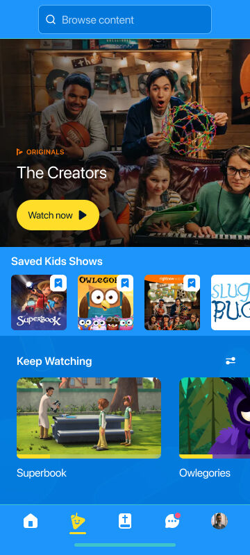
Kids (Light)
The Kids library received an updated color scheme to match branding guidelines and adhere to the user's system theme settings.
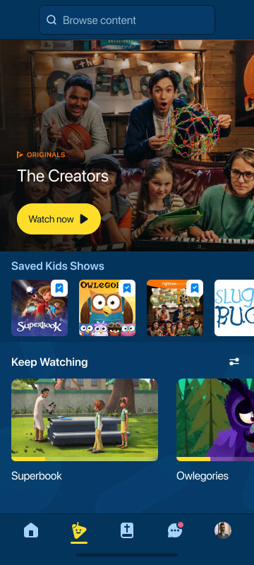
Kids (Dark)
The dark kids color scheme with the subtle kids pattern shapes in the background.
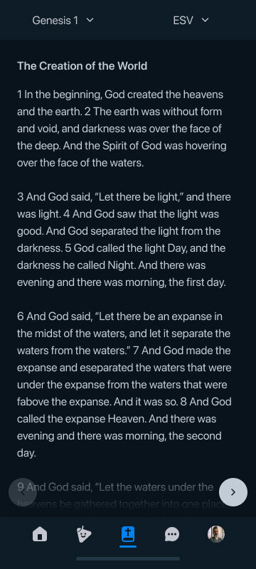
Bible
A new feature added to the app was the standalone Bible, which the web app has had for quite a while (woo!)
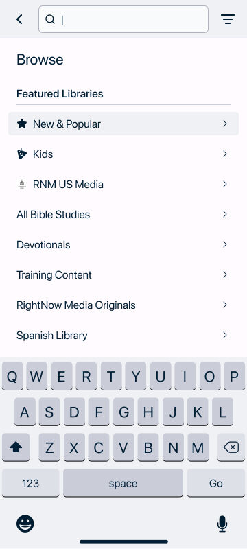
Browse
Users are afforded the ability to browse through available libraries while the search is focused by default with an active keyboard.
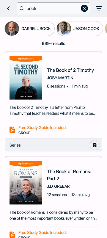
Search Results
In addition to content, users are presented with teachers whose names closely match their search.
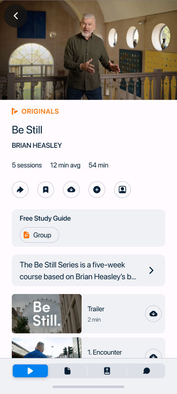
Content Details
When a user taps onto a piece of content, they are immediately brought to the player (does not play automatically) with the details.
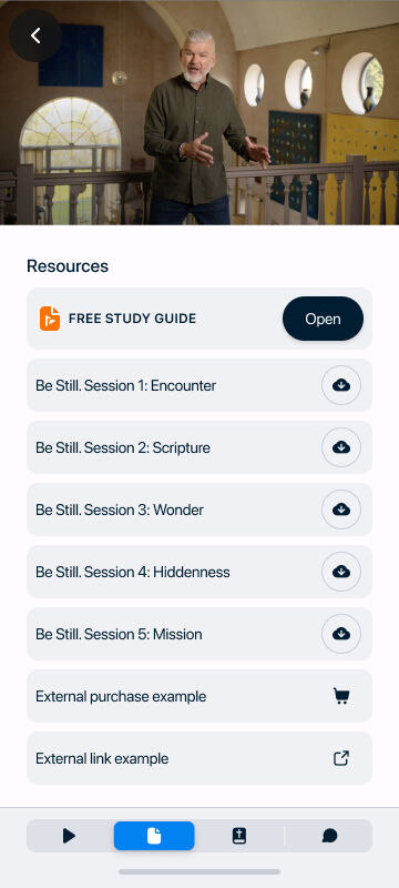
Resources
A resources tab in the content details provides users access to complementary items to download, purchase, or access.
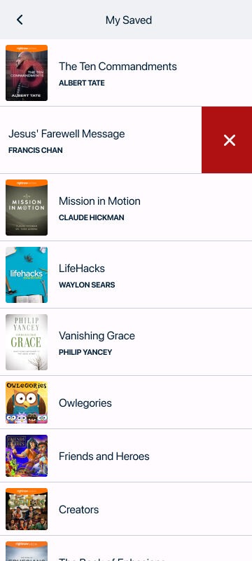
My Saved
Users are able to collate a list of their favorite or saved content to provide quick access.
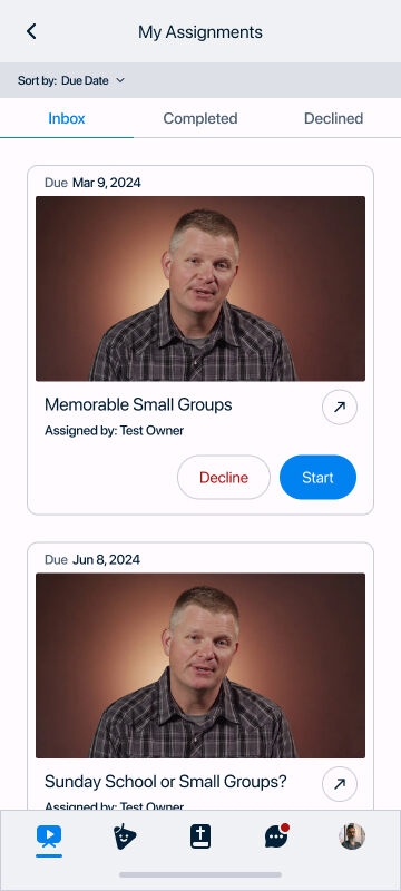
My Assignments
Users are able to access assignments that are sent to them by people within their organization to complete.
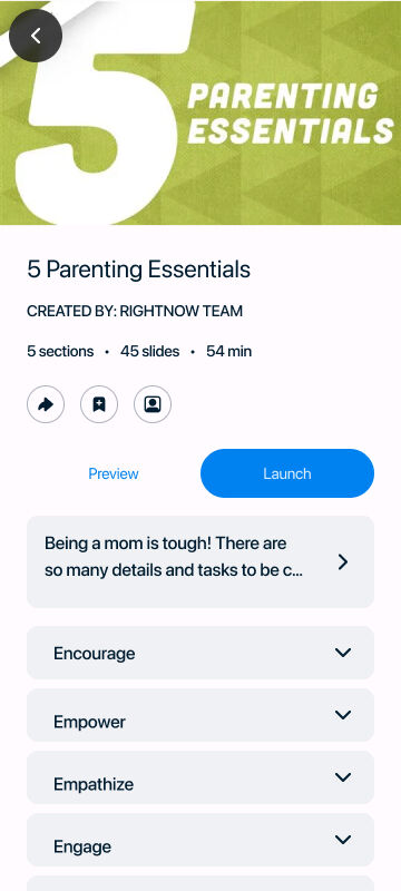
Interactive Content: Content Details
Different from other series content, assigned content details has an image and list of slides or sections, along with a different CTA.
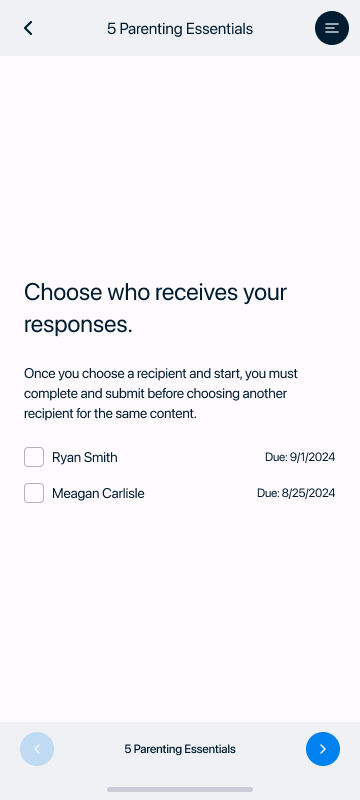
Interactive Content: Choose Recipient
When starting an assigned piece of content, the user chooses who can receive their responses.
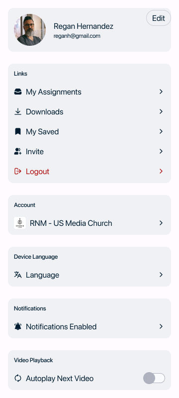
Settings
We wanted to provide users with an enhanced settings experience to manage their profile, have quick links to common actions and areas, and access device settings.
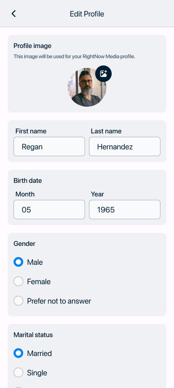
Edit Profile
We reintroduced the user profile image, which carries through all devices and mostly utilized for the new Groups feature.
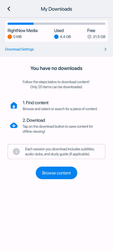
My Downloads
Users are able to download up to 10 series in order to play content offline. This includes videos, subtitles, audio-dubs, and any available study guides.
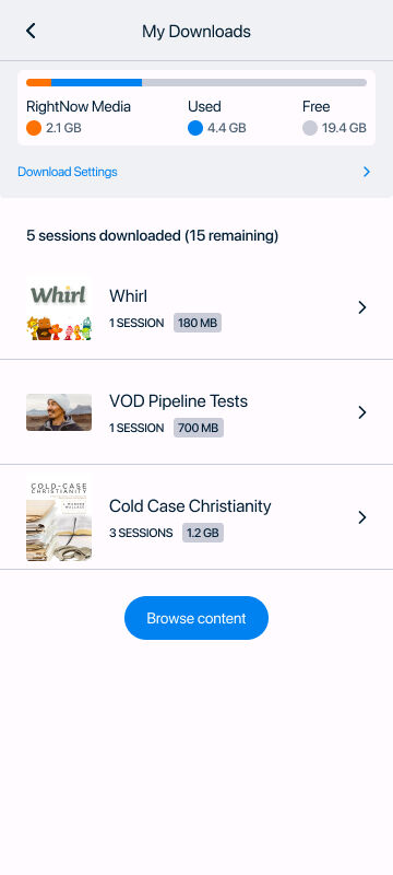
Downloaded Items
Users are provided relevant information including device storage, downloaded file size, and series information.