Component & Design System
Upon joining RightNow Media (RNM), I undertook the task of enhancing the visual and user experience of its web application. Recognizing the complexity of the project, it became evident that establishing a comprehensive component inventory and design system was imperative to address the numerous variations in buttons, inputs, typefaces, and styles utilized across the application.
The Problem
RightNow Media's presence spans multiple platforms, including mobile, TV, and web applications, each with distinct design styles that have undermined platform coherence and caused user confusion. During the initial website upgrade, a deliberate decision was made to establish a cohesive style guide as the primary reference for subsequent upgrades across all application platforms.
Research & Analysis
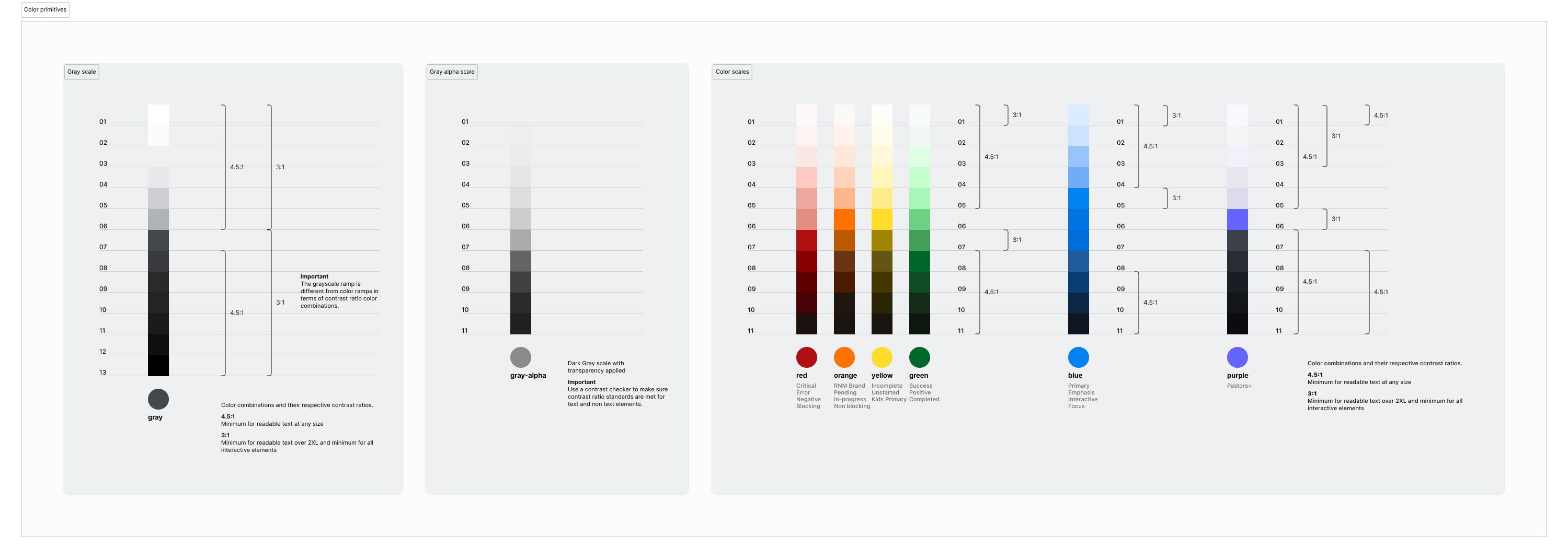
I started with taking a component inventory by going through every page of the existing applications and documenting each type of item (buttons, icons, text sizes, fonts, avatars, etc), revealing inconsistencies Using Atomic Design, I broke down the components into its smallest pieces and recreated them for documentation purposes.
Solution
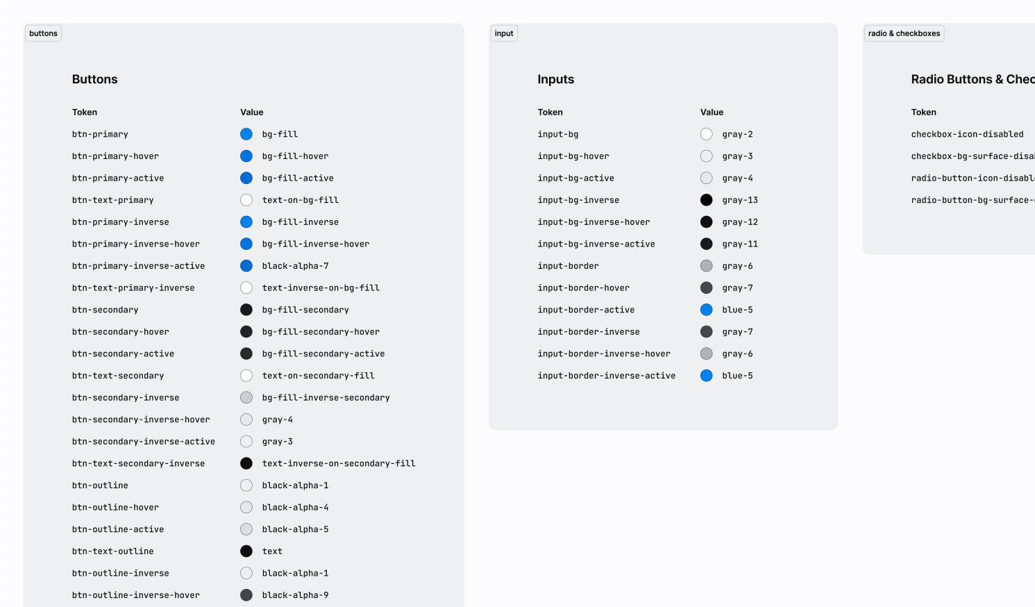
I initially created a system of Atoms, Molecules, and Organisms. Over time, I have adjusted the system to be split across two files: Core Foundation (primitive and semantic tokens) and Components (UI elements such as buttons, checkboxes, etc).
As it is a living system (which every component and design system should be), I frequently find myself needing to create something new in the system when working on new projects.
Missing Piece
The recent project of updating the mobile apps specifically exposed a missing piece of the component design system: Philosophical standards – The Why, When, and How something was to be used.
Developers were unsure of when to use certain components or why to use others. The solution was to work with them to answer their questions, identify common questions, and document the answers inside the system.
Learnings
Design systems are hard, but they don't have to be. This is what I learned along the way:
1. Work together (Product & Dev) constantly
Going lone-wolf only leads to massive amounts of rework and does nothing but fuel egos.
2. Assumptions are fine, but test them
Gut feelings, intuition, market research, user data, your CEO's great aunt's cousin – all good sources of data. Blindly updating or building a system to accommodate any of them without testing your assumptions will, at best, lead to a one-sided project, and at worst, alienate a majority of your users.
3. Humility is essential
Mark the moment you think you know better than anyone else as the moment of failure. You would be surprised where wisdom and insight can be found.
4. It's not your identity
Don't get too attached to the system. Believe in it, champion it, but understand the best thing for the system might be ripping some of it out and redoing it.
5. You're never “done”
Successful design systems should be living and ever-changing. Your product is constantly evolving; your design system should follow suit.
6. Make it mission-focused
A component & design system should be a successful marriage of business mission and user goals. Keep both at the forefront as you design and you will have effective answers when (not if, when) the designs are challenged.